Mistake 1. Website elements are not mobile responsive
Responsive web design is essential for modern websites as it essentially allows users to view your website properly irrespective of their device.
Not surprisingly, this is in line with what Google recommends and considers when ranking websites on their page. If your website isn’t mobile responsive, then you or your web designer is doing something wrong.
Mistake 2. Too many visual design elements
Try to only display relevant information on your website and leave out necessary elements that only distract the end user.
You want visitors to understand what your website is about at first glance. Since visitors’ first interaction with your website are the elements seen above the fold, having too much going on above the fold will only serve to distract the user.
A crowded website can be extremely bad for retention and having too many elements will simply overwhelm your guests.
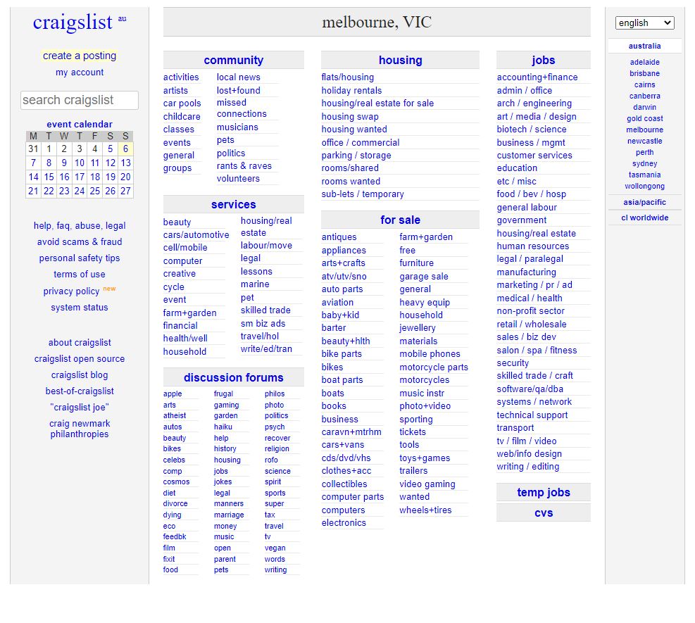
Imagine trying to browse and find what you’re looking for on the website below!

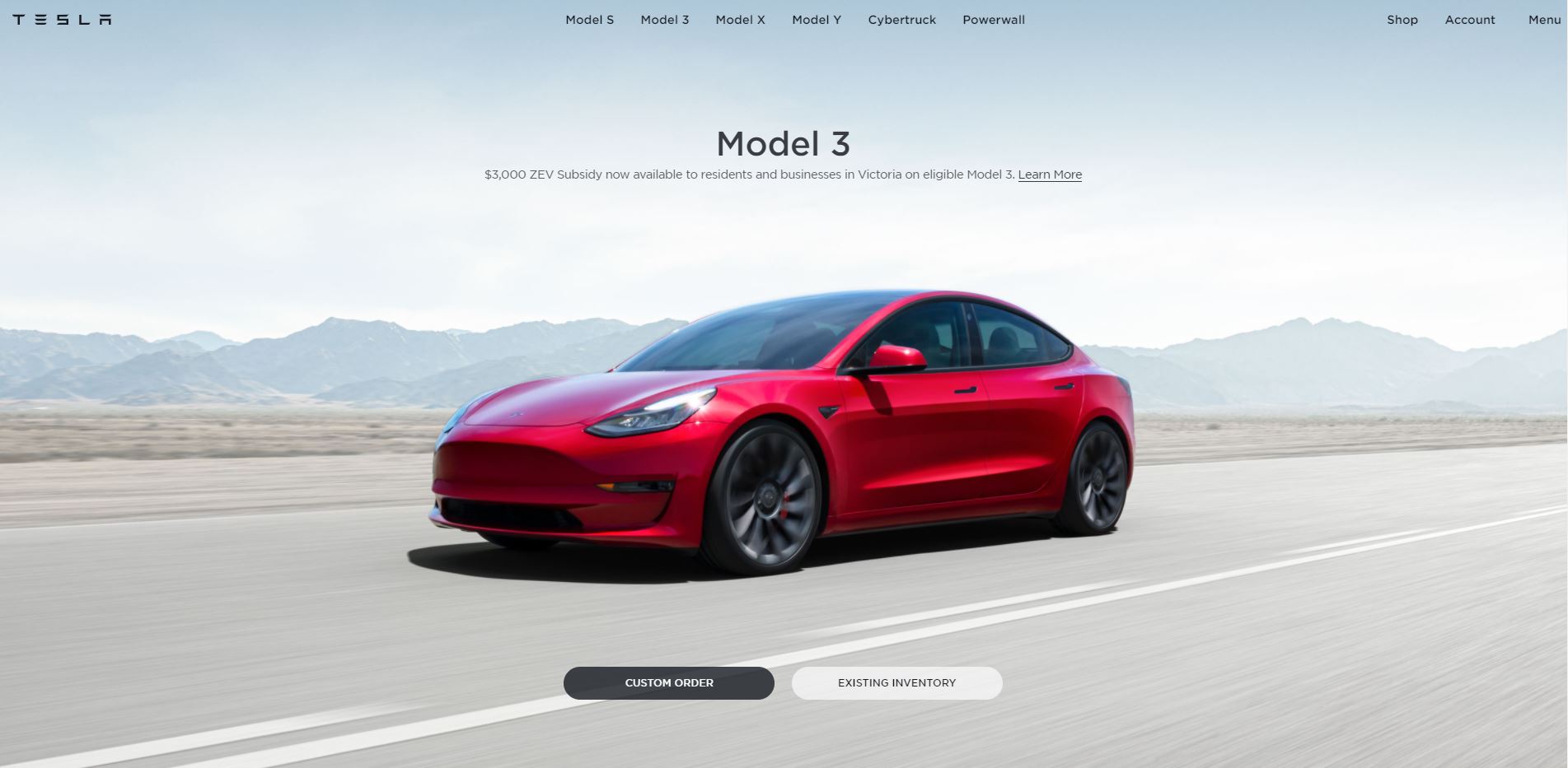
Compare that with Tesla’s website which has clearly been professionally designed.

Mistake 3. Too few visual design elements
On the other end of the scale, there are websites that are blank and empty. Minimalist design is currently very popular and works extremely well when done properly.
When done poorly, visitors are left wondering what your website is about. Visitors want to learn about your business and its products and services so having too little information could scare them away.
You don’t want visitors on your website to take a wild guess about what your business is about, so be clear, concise in conveying your message by choosing the elements on your website.
Mistake 4. No favicon or a poorly branded favicon
A favicon is a tiny addition to the website but helps users differentiate tabs when browsing. Most people have a lot of tabs when browsing online.
Having a little icon such as your logo makes it easier for your users to go back to your website. If you don’t have one, you can find free favicon generators such as this one here.
Mistake 5. Inconsistent branding or design within the website
Another common problem is that your website is too confusing. A confusing website does not have a consistent theme, imagery, colour palette and as a result, your visitors will be wondering what they’re looking at.
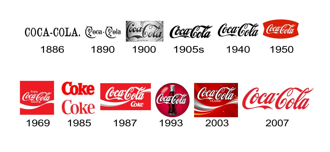
To avoid confusing your users, you need to understand your brand and convey it in a consistent manner. Look at well-known brands that spend millions on branding such as Coca Cola if you need inspiration on branding. Coca Cola has a consistent red and white logo and has had this for decades.

You want to be consistent with your branding so don’t overdo it, stay focused on your colour palette and theme. The most consistent you are, the nicer your website will turn out. By consistent with your theme, logo and font typeface and you will get a better result.
Mistake 6. Lack of call to actions
A call to action is the best way to convert your visitors. It guides your visitors towards contacting you or interacting with your website by directing them with buttons that such as “click here”, “contact us”, “learn more”, “get a free quote”, you get the point.
It is therefore important to have a clear call to actions. There should be sufficient information to ensure that visitors know what they will get from actions and what information they need.
There is a balance between helpfulness and being annoying. Don’t have too many which will in turn confuse your users.
Mistake 7. Irrelevant content
Content is a key part of your website and marketing campaign. Content is what tells readers about your business and the products or services that you offer.
Pay close attention to the type of content you choose to display on your website and how it relates to your target audience.
Your content should be relevant to your industry, product or service. Your blog and other content should be relevant to baked goods, recipes or the baking industry if you’re a bakery. The content on your website should play a large part in your SEO strategy and relevancy is crucial for Google to understand what your website is about.
It’s what informs readers about your company and the goods or services you deliver. If your topics are all over the place, it may confuse your audience.
Mistake 8. Poor image quality or image rendering issues
Photos and graphics are now an important part of the structure of your website. Images can express complicated thoughts easily without having to read text physically. That being said, many companies use irrelevant images or low-quality generic images.
Images that are not of the highest quality will negatively affect your brand and the overall user experience on your website. Similarly, irrelevant images will only confuse your readers, making them wonder what you’re trying to convey.
Mistake 9. No business contact information
Lack of contact information is another common mistake.
Having your contact details is important for trust so it’s important your business contact information is displayed throughout your website.
If a visitor needs to search your site for contact information, he or she is likely to get frustrated and leave.
Does your website have some of the issues mentioned above?
Don’t wait, get in touch with us today. Speak to one of our web design consultants to learn more about how we can help you fix your websites’ design.


